Decorative Flower
Her Realm, Personal website and blog of Cole
Jul 25

3 Ways Google’s Webmaster Tools Helps Your Site

If you’re like me, you might not like signing up for new services. I have hundreds of accounts everywhere, and if something isn’t worth my time, I’d rather skip it. However, Webmaster Tools is one of the things that you absolutely shouldn’t skip. Here’s three reasons why!

Indexing with a Sitemap

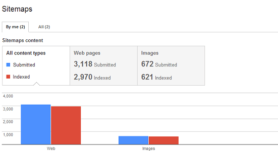
Chances are, Google won’t naturally index every page of your site, so Webmaster Tools lets you go in and add a sitemap that lists them all. If your website has several hundred pages, give it a few days. Then, when you log in, you get to see how many pages are indexed. At first, I used my RSS, but I was surprised to see how little this helped. Google only knew about 11 pages. Eleven! I opted for a WordPress sitemap plug-in, instead, and now 1600+ pages are indexed. Nice!

Google won't miss a page when you add a sitemap

Google won’t miss a page when you add a sitemap

Changing Sitelinks

Sitelinks are what Google calls all those little sublinks under your domain when someone searches for the domain name. Once your pages are all indexed, you’ll start to see them. Google automatically picks ones that work the best, but the search engine isn’t always right. You can log in to Webmaster Tools, click on a property and add certain links to the ignore list, which strongly encourages the search engine to promote other links, instead. It’s not perfect, but it does afford you some control over your website’s appearance in the SERPs.


Fix Those Broken Links

Four oh dear! No one likes a broken link, but I had quite a few, because my site had been around for so long. I’d transferred blog platforms and domains and permalink structures a couple times. For whatever reason, Google was still thinking that pages from six years ago still existed, when they didn’t. I could have saved some hassle if I started it on my broken links after the indexing completed, but I waded in before. Regardless, you can use Webmaster Tools to look for broken links on your own website–and then fix them! It results in a better experience for your users, and those links can help your PageRank in the long run.


May 08

The New Google Layout Sucks

I know I’m late with this one, especially considering that I had a sneak preview a few weeks ago but the new Google layout sucks (These people all agree). You may not have stumbled across it yet. It seems like it hasn’t completely been rolled out yet. Truth be told, you may not even have noticed it but I have and every single change is ridiculous.

Permanent search options in the left sidebar
I guess you could turn on these options before but I never did because they are useless. The options are supposed to be relevant to your search term but they already existed at the top of the page. The left sidebar just takes up room and when ads also display on the right, the content space is minuscule.
Different search bar and button styles.
The new style is very angular and stylized in such a way that it blends in awkwardly, even though the search bars are larger than they were before. It took me a while to even realize there still is a search bar on the bottom.
New logo
The new logo has some subtle colour alterations as well as a more muted bevel and drop shadow effect. It’s supposed to look smoother but instead looks like something someone thought would look good 15 years ago. This is especially odd because Google’s old logo certainly wasn’t “modern.”
Rearranged results
Maybe I’d be okay with every other change if the results appeared the same but they don’t. If you’re the type of person who skipped over the ads above your actual results, you could be missing the most relevant links. Plus,media (video, images, Twitter) and news content is not featured like it used to me. This forces you to click a link on the left (or top). Adding extra clicks is frustrating to me.
No division between search and results
There used to be a horizontal, blue bar which ran right under the search bar to separate the content. I don’t know why is feels so crucial to have the bar there but, without it, Google seems like a half-assed attempt at design from a middle schooler.

I’m also not entirely sure, but it seems as though the results are displayed in a much smaller font, too.

But I’d like to leave you with this comment I stumbled upon because it’s so very fitting:

I think it looks good and it’s very efficient. I’m a big fan of whitespace and the new sidebar provides plenty of it! I also like duplication so if a meteor ever smashes into my house and takes out the top of my monitor, I’ll still have this sweet sidebar with the exact same links ready to go. And did you see those bright, blazing, colorful icons next to the links? Wow…now that’s some eye candy! I’m hoping in future releases, they’ll expand the sidebar further to the right and give the user an option of hiding the search results to show more sidebar. That would be awesome.


Skip to toolbar